Ongaku is about quiet power and ambient layered resonance
A concept-driven identity built to honor sound, space, and cultural history.


The brand draws from cassette-era bootlegs, modernist grids, and
archival textures to create a sense of timelessness and quiet
motion. I developed the concept, design system, and
production-ready layouts across vinyl packaging, iconography, and
merchandise.
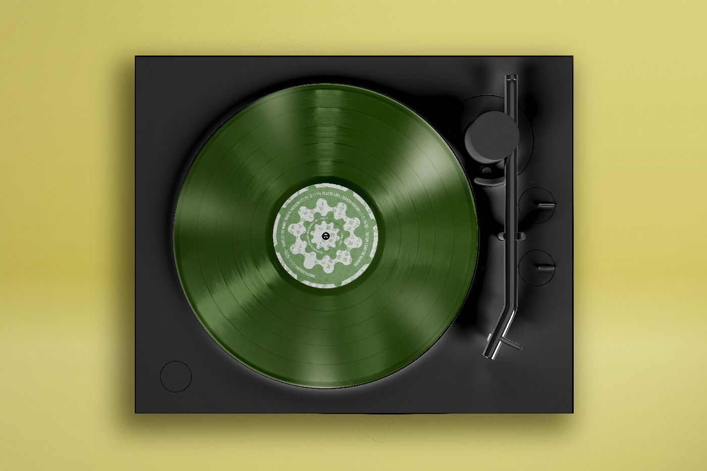
A muted palette of greens and soft
monochrome tones pairs with translucent marble textures to set a
calm, immersive tone. The ripple icon—a minimal, abstract symbol
of expansion—anchors the identity across touchpoints. Track titles
follow a traditional Kanji layout: top to bottom, left to right,
honoring original language rhythm and structure.
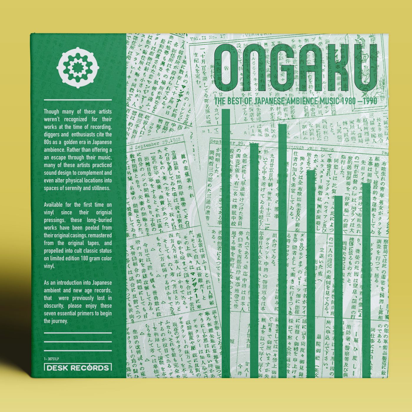
Inside,
a collage of newspaper clippings documents the forced integration
of Japanese Americans. This layer adds historical depth, drawing a
subtle but powerful connection between the musicians’ ethos and
broader cultural themes of resistance and reclamation.


A fully-formed visual system that balances analog warmth with modern restraint. Designed to feel timeless, reverent, and emotionally attuned. The work blends tactile detail and cultural respect—showing how design can carry both message and mood.


Jake Sepulveda
This template is made with Webstudio!