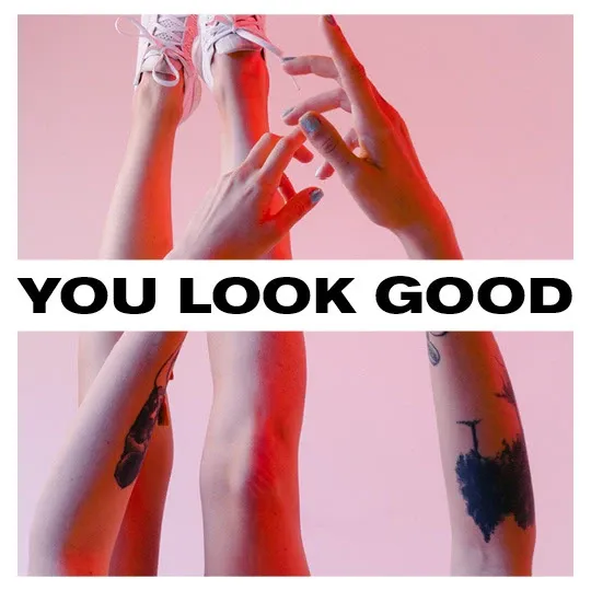
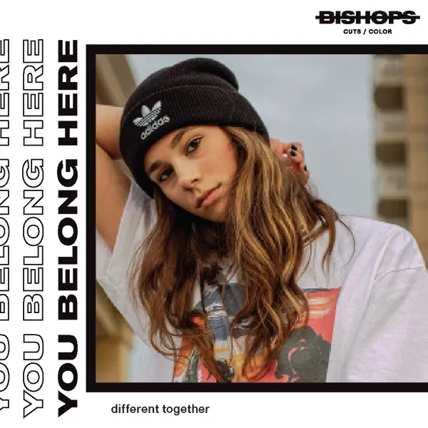
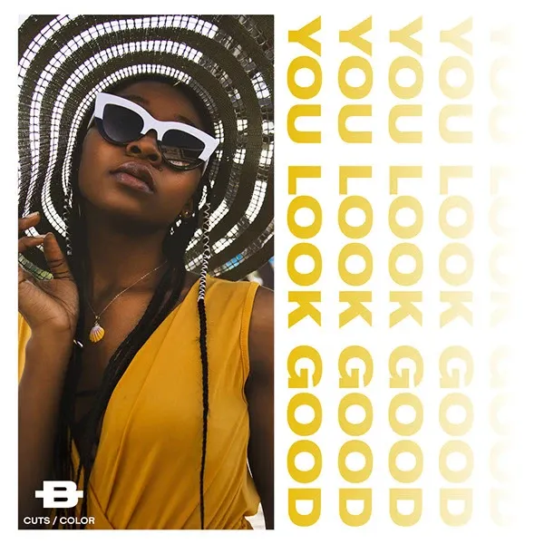
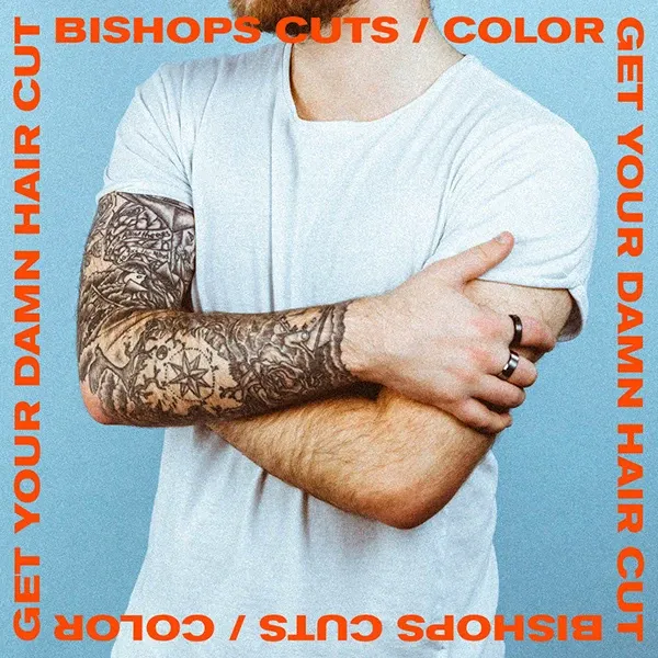
Bishops Cuts / Color is built on bold individuality and self-expression
A national brand system designed to scale style, voice, and visibility across 60+ locations.

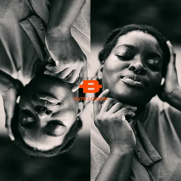
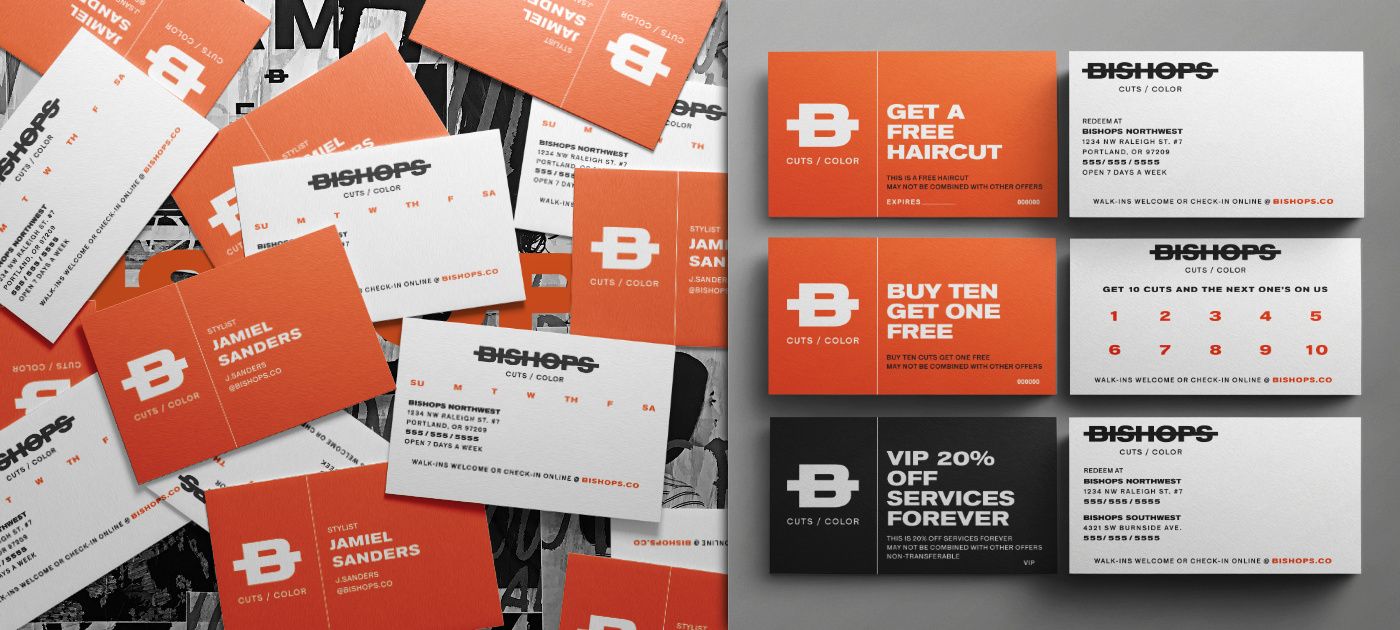
The foundation was the Brand Book: a comprehensive guide that
defined typography, logo usage, color systems, layout, image
direction, sample layouts, and more. It established a strong
visual language rooted in creativity, counter-cultural
irreverence, and community.
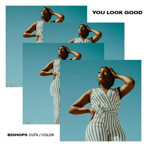
From there, I built
hundreds of marketing templates, thousands of social media
graphics, and campaign kits. Making it easy to adapt with clarity
and consistency no matter the market location.


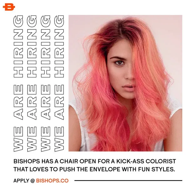


The work extended into the physical space through window vinyl, signage, and environmental graphics, as well as merch drops that kept the brand fresh, inclusive, and distinctly Bishops.

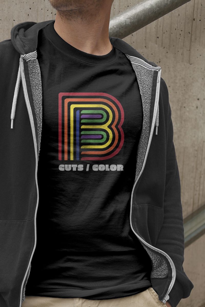

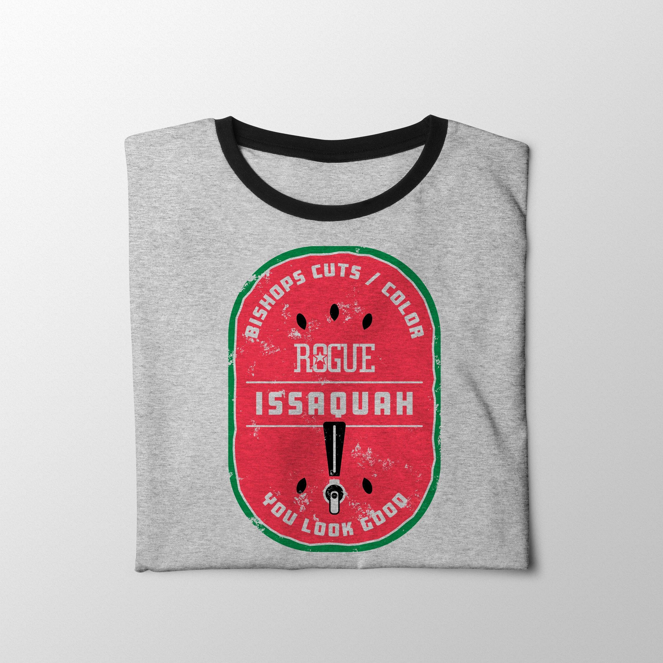
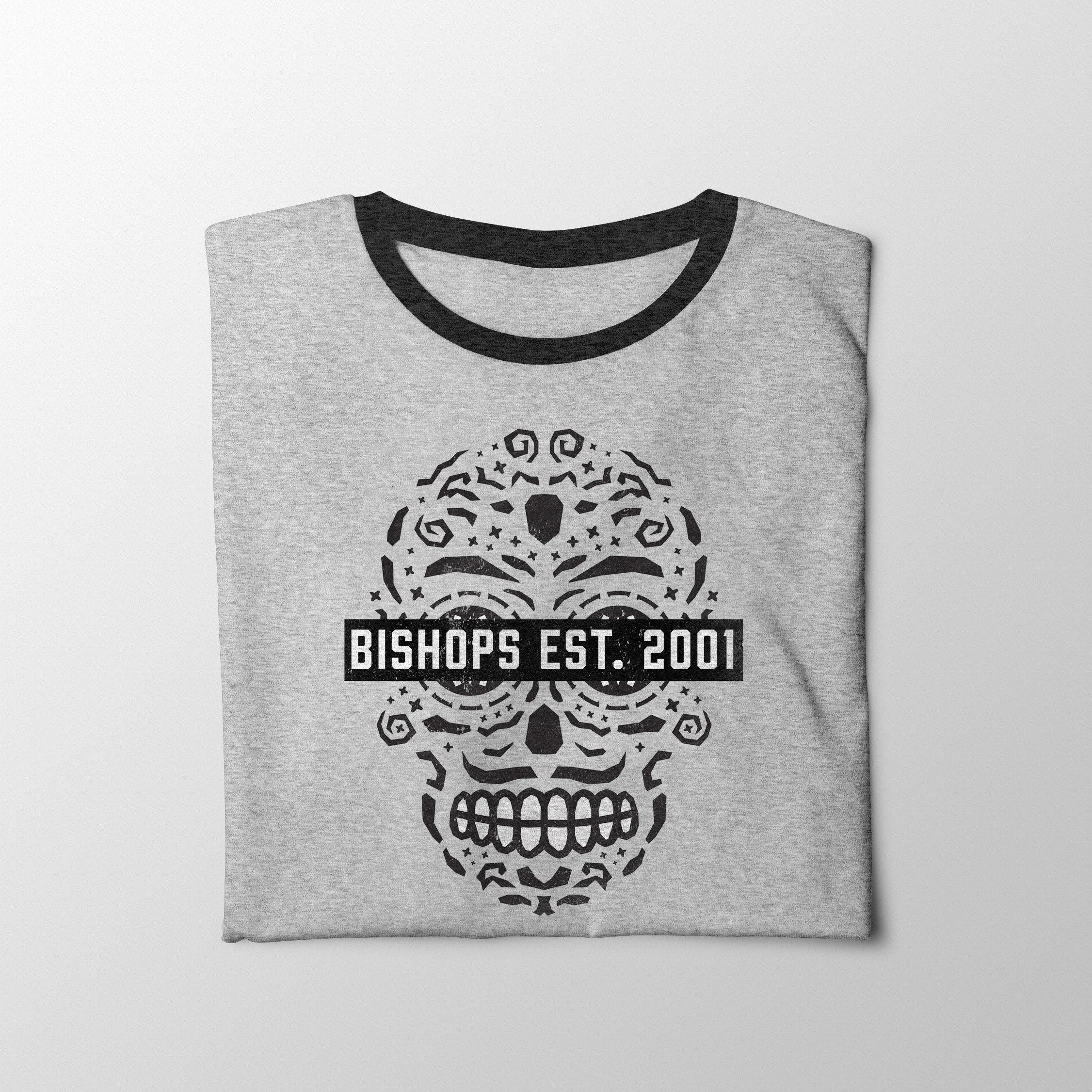
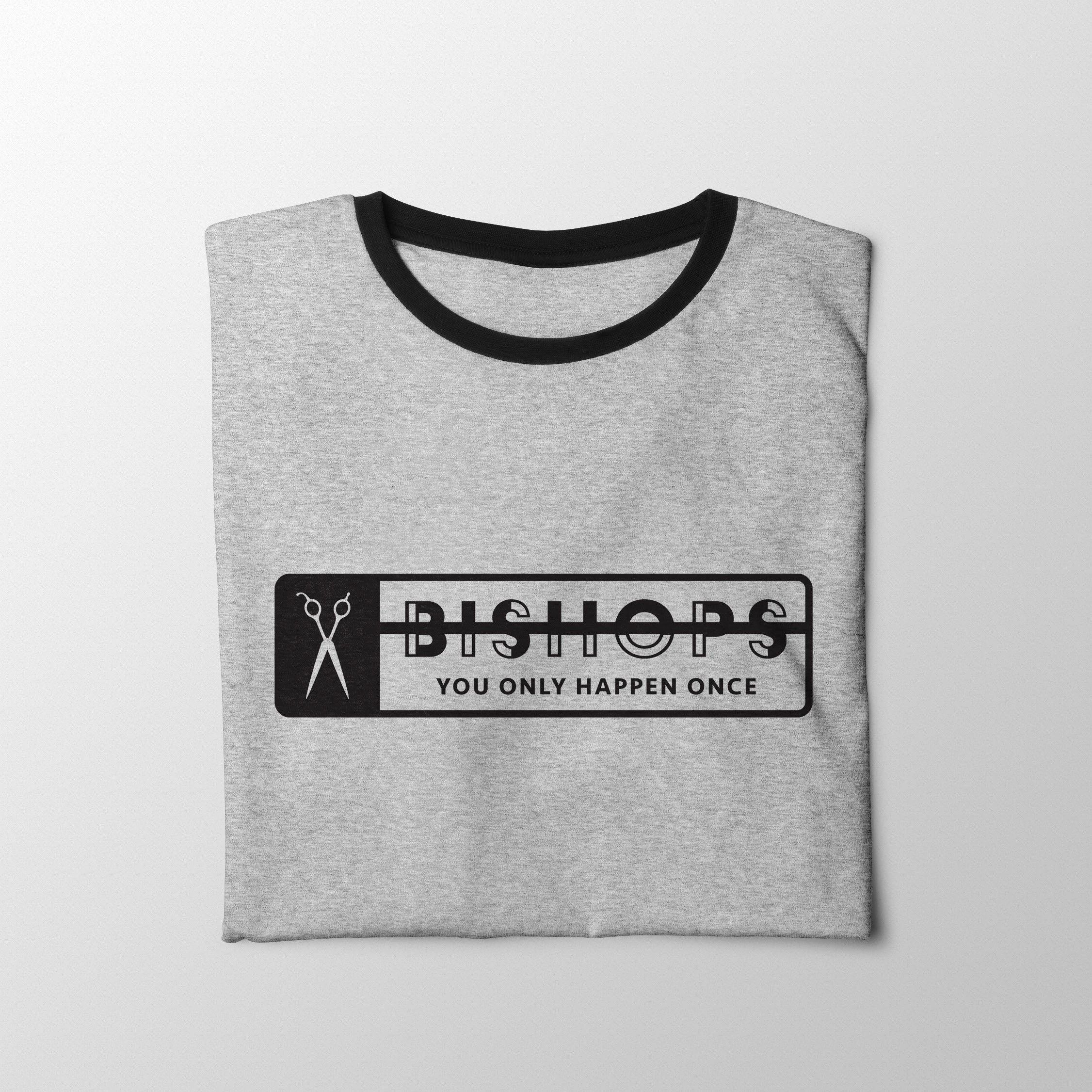
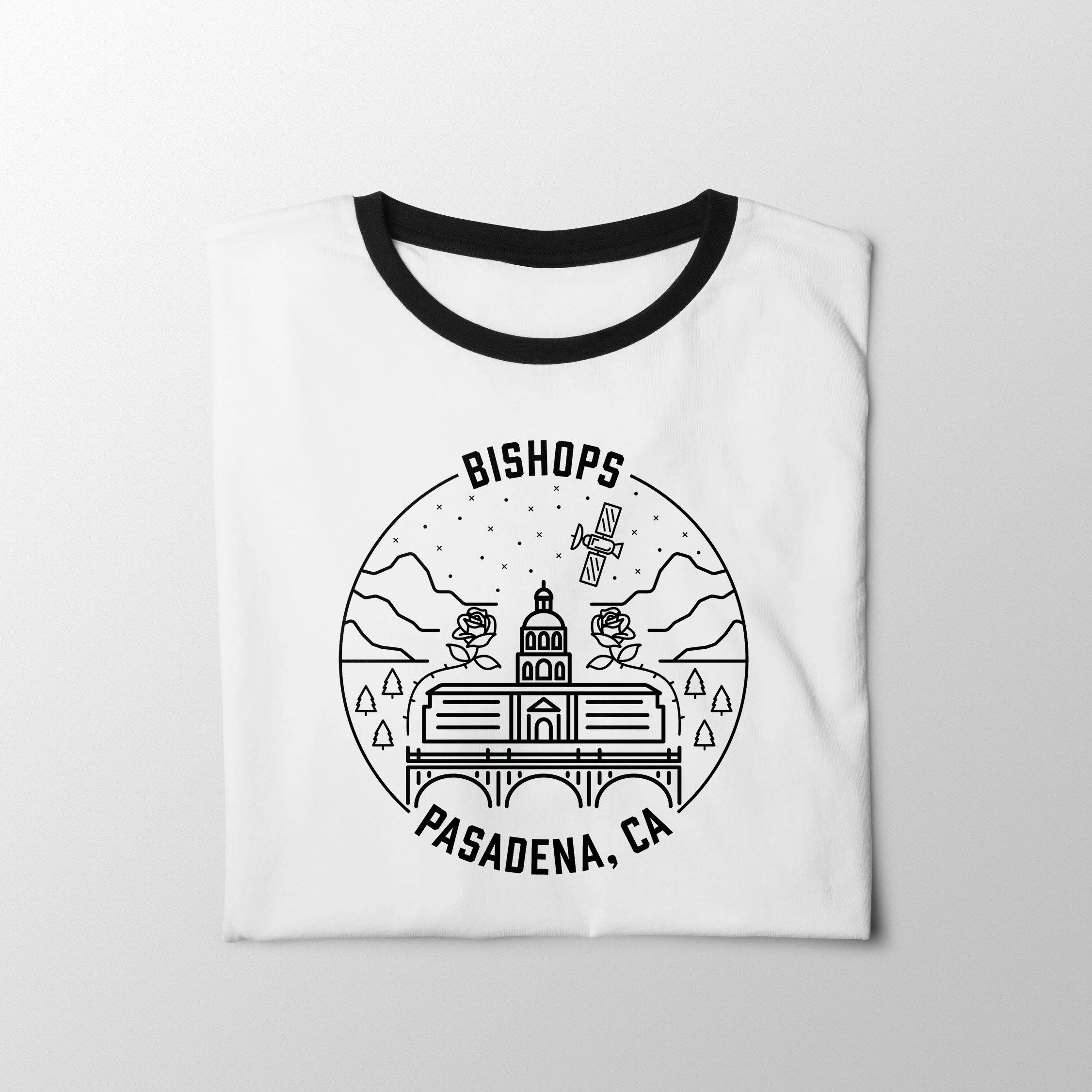
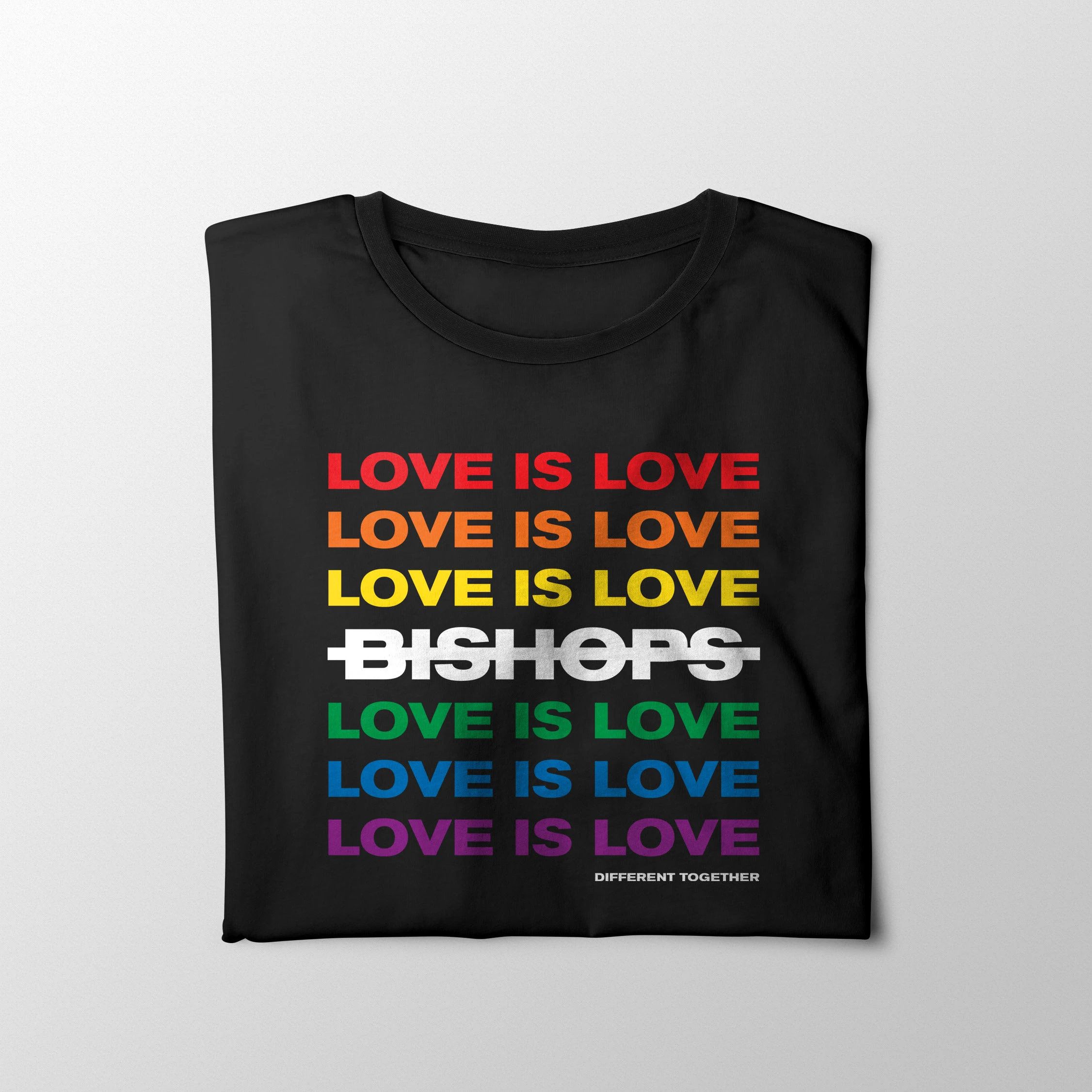

A flexible, expressive brand system that empowered individual markets and amplified local and national campaigns. The templates, tools, and materials I developed reduced production time by over 80% while boosting visual consistency across the board. The brand stayed sharp, scaleable, and unmistakably bold, no matter the format or location.


Jake Sepulveda
This template is made with Webstudio!