Alidade Coffee Roasters
Brand Identity and Packaging Design


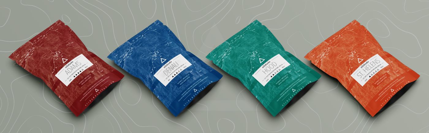
The brand was built around the concept of an alidade–a tool used for navigation and orientation. That idea drove the
visual language: layered topographic textures, peak-shaped
markers, and bold modern type.
The packaging system
flexes seamlessly across core blends and seasonal editions.
Digital templates support social and web consistency, and
environmental graphics, like window installations, tie everything
together in physical space.
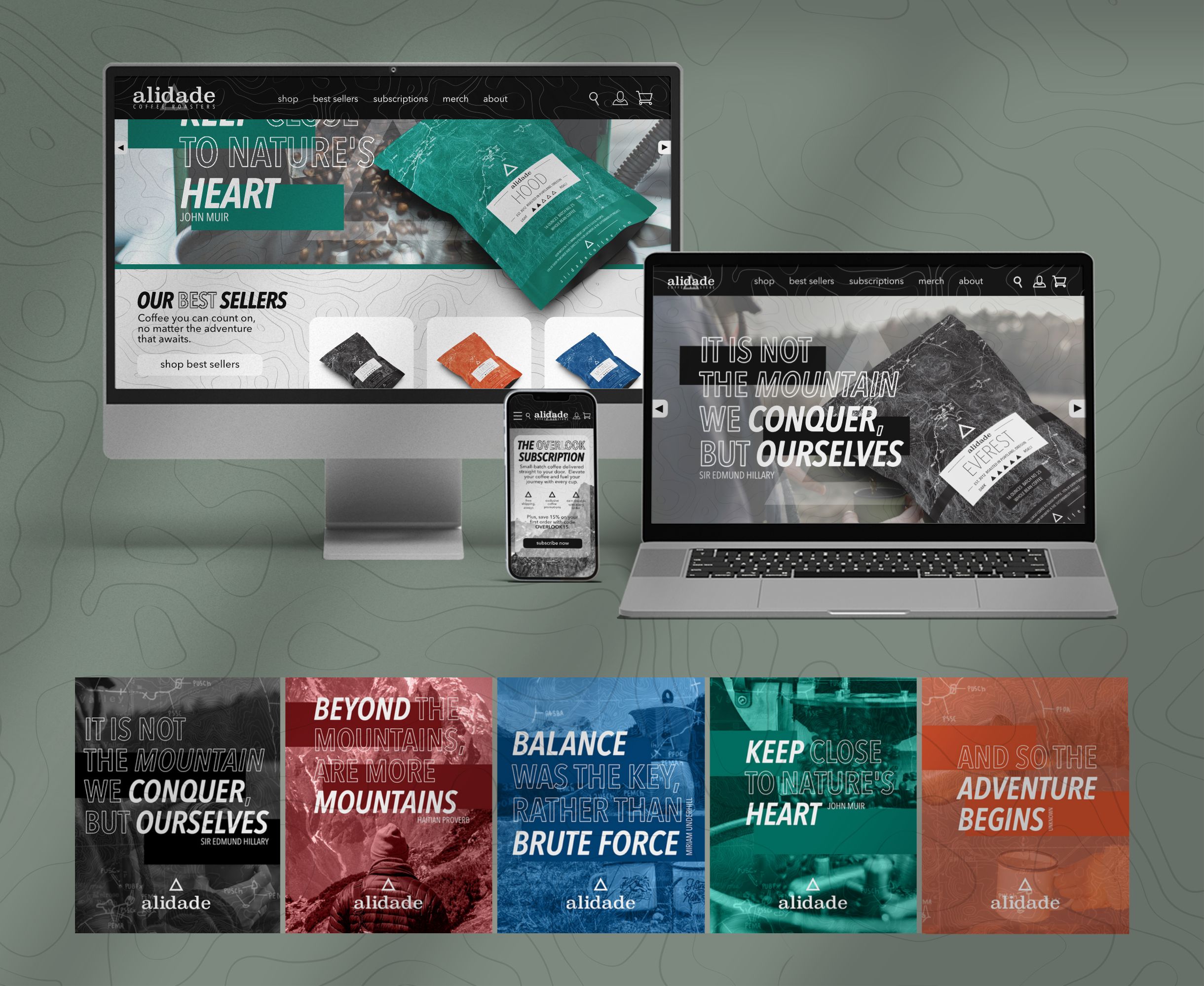

A fully-realized identity with clarity, narrative, and structure. Built to grow with the brand. The system balances storytelling and scalability, and shows how thoughtful design can bridge the digital and physical divide.


Jake Sepulveda
This template is made with Webstudio!